Mr. Bazaar on Instagram!

COPYRIGHT © 2009 - 2012 BRIGHT.BAZAAR

Tuesday 31 August 2010

{Tomorrow}

Yesterday was a bank holiday here in the UK, so I'm taking a little break today to enjoy the last slice of summer sunshine! I'll be back tomorrow with a review of the October issue of Livingetc. See you then, friends!

Monday 30 August 2010

{10 Things I Learned This Weekend...}


1. Saturdays make a great time for cocktails o'clock - shake, shake!
2. Saturdays with old friends and dancing provide much banter/laughs/general larking.
3. Saturdays with cocktails, old friends, dancing and a great Chinese meal are tops.
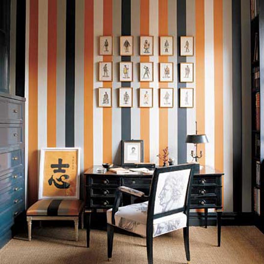
4. Amongst all the festivities I found time to hang my new print.
5. Wii Sports Resort makes you discover muscles you never knew you had!


6. Sunday morning trips to the deli can be lethal on the old bank balance.
7. I need to learn to exercise more self control in said deli. Capers! Olives! Gherkins! Bankruptcy!
8. Toast's Autumn/Winter catalogue is certainly easy on the eye. (Also, the brand's first ever men's collection launches in September).
9. Nigella makes figs pretty darn well.
10. My Macbook is flirting outrageously with this Grey Wool Felt and Brown Leather case. The done thing to do is play matchmaker, right?!

Sunday 29 August 2010

{Sunday's Bright Links}

1 via 2
Christina from Full House posted an ode to the end of summer.
For illustration inspiration check out Claudia Pearson's blog; her fall tea towel is fantastic!
Three colourful push bikes captured through the talented lens of Nichole.
Jan shared tales of a handmade wedding.
The Rue ladies teased us with another tasty sneak peek over on CasaSugar.
Go on a 10-hour photographic journey through New York City.
Up for a bit more NYC action? Ah ha! Then, you'll be wanting to check out Chantale's recent trip, here and here.
Justina wrapped the week up by kindly sharing some free printables.

Saturday 28 August 2010

{Happy Weekend}

Hurrah for Saturdays! I'm pleased to see the weekend; it's been a long week. Our old housemates from The University Days are coming to stay with us in our new apartment, so I'm looking forward to having a good ol' natter and a maybe few cheeky cocktails. Thank you for all your lovely comments this week, whatever you are up to over the next few days I hope you have fun!

(Left to right, from top) 1 | 2 | 3 | 4

Friday 27 August 2010

{Colour Cocktail: Blue and Yellow}

As soon as I stumbled upon the blue and yellow checkered floor (below) I knew I had to put a cocktail together for the smokin' hot duo. These two vibrant personalities make for one heck of a scorcher; they're out there loud and proud. So I guess first off it would be easy to think they could end up rubbing each other - and you - up the wrong way if used in a small space. Well, just like the mini dining space (below, left) they do actually work harmoniously in compact corners, especially if teamed with a hot-to-trot geometric pattern. Yep, I just wrote hot-to-trot. I mean, if you're gonna crack that one out, it's gotta be for this sexy number. Looking to add a splash to a larger space? Order a round or two of these in-your-face cocktails and you're Statement Sorted.

Left to right, from top: 1 | 2 | 3 | 4 | 5 | 6 | 7 | 8 | 9

Thursday 26 August 2010

{Orange}

This Bright.Bazaar guy is craving a little dose of orange in his life. Ok, maybe a bit more than a little! So there's only one thing for it folks, a triple helping of The Bright Stuff. From burnt hues to poppy brights, this colour is one of my all time favourites (I blogged about it's zing back in March). Kicking things off is a little combo of stripes and orange (1) which gives that home office some serious masculine charm. For uplifting and happy spaces I like the lighter, brighter hues (2, 4), especially those dining chairs (7) and the striped bench (8) in the breakfast bar. It turns out orange looks pretty darn good in a stripe pattern. That said, they're all tempting spaces for me, but it would be wrong not to pick a favourite or two, right?! I say: give me the artwork from that grey living room (4) and those hot orange stools (9) and I think my cravings will be satisfied. For now, anyway...

1 | 2 | 3 | 4 | 5 | 6 | 7 | 8 | 9

Wednesday 25 August 2010

{Home Tour: Country Guest Cottage}

Anyone who paints the outside of their guest cottage bright yellow is instantly onto a winner with me. The inside of this modern country cottage is just as pleasing: the studio may be small at 320 square foot but high ceilings have allowed for a loft bedroom to be added, allowing for a charming wooden ladder to take pride of place next to the kitchen area. The owners have kept the canvas clean and simple with a white wash throughout, which in turn has provided a refreshing backdrop for the colourful accessories and found items they've used to add character. This space has not been decorated with over sized statement features or furniture, but rather delicate touches of colour and small details have been added to make it into the delightful and welcoming cottage that it is today. P.S. I'm warming up for the weekend Jami-style with a Peppermint Martini today, so be sure to check out her lovely blog.

Images via Apartment Therapy | Layouts by Bright.Bazaar

Tuesday 24 August 2010

{ZARA Home: Autumn/Winter Collection 2010}

Outside the wind is howling and the rain is lashing against the window; it's weather that couldn't be more perfect for putting together this post on ZARA Home's autumn/winter collection. Luxe nudes, sensual browns and jewel pops all feature across their bedroom, bathroom, living and tabletop assortments, making for a versatile and accessible collection. This is what I enjoy about ZARA Home - much like their clothing brand, their homewares are affordable with a high-end, luxury look. From late night candle light dinners to lazy mornings enjoying breakfast in bed, this store has the season's homewares all wrapped up.

Monday 23 August 2010

{10 Things I Learned This Weekend...}


1. This shirt and bow tie combo from Topman is too cute.
2. Turns out scrabble letters make for a rather darling wedding card.
3. Warwick Castle is a building that oozes confidence and grandeur.
4. Sunshine-laden walks through the park are simply perfect.


5. There might have been some excited yelps upon finding out that I won the fantastic Jonathan Adler giveaway hosted by Beth at Nest Interior Design. Yeah!
6. Bonnie reminded me how much I like geometric patterns with this snap of the floor at The Standard Grill, NYC.
7. More excitement as I discovered I won David's Savoir Faire giveaway.
8. The parcel which arrived from a great friend contained back issues of ReadyMade and made my weekend.
9. A bowl of spaghetti (lashed with cracked black pepper) is my ultimate comfort food.
10. SALT is not a good movie.

Sunday 22 August 2010

{Sunday's Bright Links}


Those lovely Rue ladies teamed up with Shelterpop to tease a peek of the premier issue.
The video for Banana Republic's fall collection features push bikes, golden leaves, friendship and fashion. What's not to love!
First look at the 'Fabulous Fall' cover of Sweet Paul's second issue.
I'll be joining Julie for a dip in this infinity pool - the more the merrier!
Michelle knocks it out the park with a corker of a post on what Italy means to her.
Beth reminded me of the pleasures to be had from good food, even better wine and cracking friendships.
Jami and Ashlina slipped on their best dresses and attended a sparkling Trina Turk event.

Saturday 21 August 2010

{Happy Weekend}

Could these vases be anymore suitable for Bright.Bazaar? I've been drawn to blue vases recently, so the bottom row definitely stands out for me. But, really, who am I kidding, I love them all! Which is your favourite? Thank you for stopping by this week; have a smashing weekend, folks.

Friday 20 August 2010

{Colour Cocktail: Navy and White}

He's thinking green walls; you're thinking grey walls. We've all been in those situations when you just can't decide on a colour scheme that you'll both feel happy living in. Well, next time this happens, instead of grabbing the nearest pillow and heading in for your first whack (!), pour yourselves a navy and white colour cocktail. With it's perfect blend of masculine statements and feminine notes, this little number will sort you both right out. The bedrooms below show how to rock this look: a graphic wallpaper marries perfectly with the feminine floral fabric used for the bedstead. Meanwhile, across the way in bedroom deux, the three shades of navy adds visual layering and interest into the calmer scheme; that's why I picked out the ampersand (below) - a bit of cobalt thrown into the mix can help spice things up!

Images (left to right, from top) 1 | 2 | 3 | 4 | 5 | 6 | 7 | 8

Thursday 19 August 2010

{Home Tour: Downtown L.A. Loft}

When I first saw this space over on desire to inspire I knew I had to blog it; I've been craving some masculine, industrial-flavoured spaces for the last couple of weeks. There's a little slice of everything I dig within interior design here: it's a compact, but excellently designed loft. For starters there's not one, but four of the Marias stools in the perfect grey hue. Then, I found myself scribbling ideas in the ol' notebook about how to decorate my space with books and artifacts without it looking like a jumble sale. Sean, the owner, has mixed an old fire extinguisher with DVDs, books and candlesticks, and it still looks effortless and relaxed. I'm sure Chris' work in designing the loft helped with this - look closely at the second image and you'll see a hideaway cinema screen, which actually looks like it's meant to be there. By the time I saw the details in the bedroom space I was too engrossed in the space to write notes! The masculine ethos of this place is perfectly balanced with soft details like the 'dream' typography, vintage typewriter and luxe textiles. Whats more, there's even that all important hit of colour that you guys know I can't be without.

Images via 12 | Layouts by Bright.Bazaar

Wednesday 18 August 2010

{Sneak Peek: New Jonathan Adler Books}

What better why to brighten up that midweek slump than with a little sneak peek into Jonathan Adler's two forthcoming books. 'Colors' and 'Accessorizing' are both out in November and you won't win any prizes for guessing how much I'm looking forward to reading them. A big thanks to Suze who gave me the heads up that the French Elle Decoration team had published these Gilles Trillard snaps of Jonathan and Simon's NYC apartment. Swoonalicious, much? We're talking symmetry to make your inner OCD yelp with delight, and enough colour to keep this Bright.Bazaar boy happy, happy, happy!

1 via 2

Tuesday 17 August 2010

{Elle Decoration September 2010}

Another week means another September issue for us to enjoy. This week it's the turn of Elle Decoration, who have put together a good issue, but not an excellent one. Normally their covers are outstanding; vibrant and full of interest - July and August are strong examples of this - but September's, for me, didn't spark the same excitement as the last handful of issues. However, I needn't have feared for long because Michelle Ogundehin's excellently written Editor's letter (2) perfectly demonstrates the ethos of this magazine. Yes, it's about aspirational living, but at it's core it's about spending only when needed and making the most of what you've got. It's worth buying for her wise words alone. So, cover choices redeemed, we get a peek of Elle Deco's charity mugs (3) in aid of Shelter and a feature on the continuation of brights (4) in the high street collections this season. That gorgeous bathroom (5) sits within a spread on decorating with nudes and the quirky front doors (6) are from an editorial on making your home's exterior fabulous. A quick interview (8) with fellow Brit, Sophie Conran, and we're into the home tours (10, 11): sneak peeks include a light and airy Melbourne home; a versatile NYC loft; inside/outside living in Cape Town and a Norway retreat. There's an inspiring image for the 'High Hopes' opener (12) on extending kitchens upwards and a charming kitchen accessories spread (13, 14) follows. Vera Neumann (15) rounds off the issue and her words, "A bland cocoon is a dull existence" couldn't resonate with me any harder. P.S. There's also a great 'Space Plus' supplement free with the issue; I've picked out the highlights of it below (16, 17). Right then, what's inspired you most from the issue?

Related Posts with Thumbnails
window.location.href="http://www.brightbazaarblog.com/";