Mr. Bazaar on Instagram!

COPYRIGHT © 2009 - 2012 BRIGHT.BAZAAR

Tuesday 31 July 2012

Sneak Peek: Adore Home Mag, Summer 2012

The Internet is such a wonderful invention, isn't it? When its inventor, Sir Tim Berners-Lee, appeared in the London 2012 Olympic Opening Ceremony it struck me again just how amazing it is. To think how this one man created a platform that has led to so many technological advances across our world - it's mind blowing. Just one tiny slither of this amazing invention means we are lucky enough to soak up interiors inspiration from across the world at the click of a button (or the swipe of a finger for our iPad friends!). And this just what we are doing today as we take a trip to Australia for an exclusive first look inside Adore Home's new digital issue, which is set to launch tomorrow. I've long been a fan of the Australian interiors scene - bold, fearless, exotic and full of colour, it rarely fails to disappoint. Our sneak peek starts with a tour of Threefold, a new food and wine bar in Melbourne with a great rustic-industrial design by Travis Walton. Next up we take a change in tone, with the calm and refreshing palette seen at the Bayshore Bungalows in Byron Bay - ideal for getting some nautical summer decor ideas. The third peek shows us the exotic, jungalow style of PAD (Passionate About Design) store in Sydney. I love the uber chic dark painted walls with bold flashes of Kelly Green accents. Finally, the issue is set to feature fifteen of the world's top designers, stylists and landscapers, each giving their top tips to creating the perfect outdoor space. My favourite? It has to be a tie between David Jimenez's Palm Springs retreat-like space and the city chic yellow and white themed Sydney terrace designed by Greg Natale. Enough of what I like, what do you like, friends?!
// All images courtesy of Adore Home magazine

Monday 30 July 2012

10 Things I Learned & Loved This Weekend

1. I was pleased to find these red, white and blue stripe seat pads in the sale. They are ideal for softening these hard school chairs.
2. Of course, I had to hang some Team GB bunting to show my support for the team in their London 2012 Olympics campaign!
3. I snapped this evocative sunset as I walked to dinner with my mum on Saturday night.
4. Next time I'm in NYC, I'd like to visit Catbird to pick up one of their beautifully packaged candles.
5. Picking out your first olive tree with my heartmate was a special experience.
6. I spent Sunday making curtains whilst intermittently screaming at my TV during various Olympic events - fun!
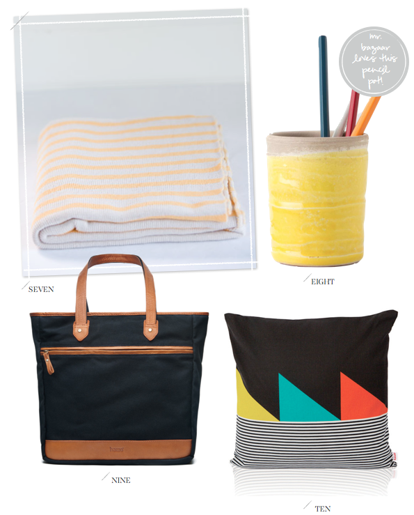
7. Words cannot express how much my heart beats for this stripe yellow blanket from Father Rabbit.
8. My pencils spent most of the weekend flirting with this pencil cup!
9. I love this sophisticated and stylish tote from Hasso.
10. Graphic, colourful and stripy, this cushion combines three of my favourites!

Sunday 29 July 2012

Sunday's Bright Links No. 87: Alfresco Dining

Elsewhere
Love this DIY paper strip tray - so colourful and fun!
Lindsay's photographs and account of her Finnish travels made me want to visit right there and then.
Free printable drink flags - great for parties!
Be sure to read the summer issue of Wayfare magazine.

Bright.Bazaar
Last weekend I played peek-a-boo in my new bedding, looked at fabric samples, visiting a traditional English sweet shop and much more!
Inspiration for summer living - indoors and out!
Take a tour of Jamie Oliver's industrial Italian restaurant by the London 2012 Olympic park.
// 1. Stacey Van Berkel | 2. Nicolas Matheus

Saturday 28 July 2012

Happy Weekend: Colourful Wardrobe DIY

Happy weekend, friends! I'm so pleased the weekend has arrived as I've just moved into a new apartment and I'm keen to start putting my stamp on the place. I have curtains to make and furniture to arrange, rearrange and then rearrange again! Plus, my mum is visiting for the day so I'm looking forward to catching up and going for a little shopping trip together. What are your plans? If you're looking for a fun DIY then this project is a perfect way to add bolder hues into a bedroom space. By painting the inside of the wardrobe in a hot hue, you only see it when you open it - a quirky, unobtrusive way to add colour. Start by emptying the wardrobe, masking the desired area to be painted with tape and then sanding the wooden surface down. Wipe clean with a damp cloth and then priming with at least two coats to give a better final finish. Once dry, paint with your desired colour and varnish when dry to protect it. Finally, peel off the masking tape for perfect edges. Too busy to DIY? No fear, you can buy these colourful wardrobes from Bababua. I'd love to know what colours would you choose if you did this DIY?
// Bababua

Friday 27 July 2012

Store Tour: Jamie Oliver's Industrial Italian

I've long been a fan of Jamie Oliver's relaxed approach to cooking; his kitchen ideology sort of matches up with the way I like to decorate - have fun with it and express the things and people you love through your decor choices. Well, as the Olympics are due to kick off this evening here in London I thought it would be fitting to give you all a tour of Jamie's new restaurant, Jamie's Italian, which is located right next to the Olympic Park. The interior was designed by Blacksheep and they've worked stacks of decorating features into the industrial space that are perfect for introducing back at home. If you have an open plan kitchen-dining area, why not zone the dining area with a chequerboard tiled flooring? Or, if you can't change the flooring, you could use subway tiles or wood panelling on the walls for a rustic-industrial look. One of the main things to do when decorating industrially like this is to work some warmth into the scheme, otherwise it can feel cold and overly harsh. At home you could do this with some tactile linens or textiles - soft drapes over the windows, or a linen covered cushion pad along a bench by the table. It's a good idea to work an accent colour into the space, too. Here, exposed wooden beams and patterned tiling have been anchored by a strong burnt orange hue. Are there any elements you would work into your home?
// Photography by Gareth Gardner | Interior design by Blacksheep

Thursday 26 July 2012

Impasto: Painterly Stokes & Flamboyant Florals

I'm always excited to see a new collection from Harlequin as their bold and colourfully patterned fabrics never fail to disappoint Mr.Bazaar. Launching in August 2012, Impasto is a gentle collection detailing painterly strokes alongside flamboyant florals. Described by the brand as dramatic, uninhibited and vibrant, it's clear to see that Impasto has been inspired by the loose stroke-style and light-reflecting techniques of the Impressionist movement. The collection was designed by Harlequin Studio’s Rebecca Cox, who hand-painted each design. I was interested to learn that 'Impasto' comes from a technique used by the Impressionists, who expressed themselves in their art-work through the use of very thickly applied paint, usually so thick that the brush or painting-knife strokes are visible. Interesting to know, right? I like how the technique has been applied across the Impasto collection on an array of tactile textiles, from shimmering silks and cottons to sumptuous velvets and weaves. Beyond the materials, I'm drawn to the rich and indulgent colour palettes that have been used: the inky blues and pink hues are brought to life through floral prints, abstract geometrics and ombré stripes. Anything catching your eye, folks?
// Harlequin

Wednesday 25 July 2012

Home Tour: Colourful Home of Sydney Artist

One of the reasons I started writing Bright.Bazaar was because I felt passionate about people using colour to express their personalities through home decorating. So you can imagine my instant delight the moment I saw this tour of Daimon Downey's Sydney home. And, really, Downey's home couldn't be more fitting: he has literally decorated his home with his own colourful artworks and quirky finds; the items upon his classic Parker sideboard are testament to this. The reflection of Downey's relaxed vibe continues as sporadic brushes of paint adorn chairs throughout the property. Yet, his use of colour isn't entirely unhinged - notice how the dining area is painted in a bold orange hue across the two corner walls. This helps to zone the eating area as a separate space from the rest of the open plan room. Fresh, vibrant and invigorating - I love this home! What do you like about it?
// Styling by Mr Jason Grant | Photography by Felix Forest

Tuesday 24 July 2012

Summer Living: Indoors & Out!

Perhaps it's the beautiful weather we're finally experiencing here in London, but for whatever reason I'm feeling super inspired today by this summer living shoot by the team over at Dalani. Having grown up in the countryside I've always felt an affiliation with being outdoors. Now, I'm not exactly the hiking type but I do like the country idyll of being closer to nature's natural beauty. What can be better on a summer's afternoon than moving the table and chairs outdoors and styling up a little afternoon tea for close friends? Update your existing outdoor pieces with a scattering of throw cushions and an array of terracotta pots over following with fragrant herbs. Or, create a little haven to read by layering up textiles with throws, pillows and outdoor rugs. If you're looking to bring this outdoor vibe inside then why not update your sofa with a tropical palm print fabric? I also love the idea of creating a summer themed inspiration wall of seasonal tear sheets. The key to making this look work indoors is to use plenty of organic materials and fresh, green hues - I'm really tempted by the mango wood Industrial Coffee Table. Is anything catching your eye from this Dalani collection?
// Dalani.co.uk magazine | Styling by Talib Choudhry assisted by Harriet Loraine-Smith | Photography by Chris Tubbs

Monday 23 July 2012

10 Things I Learned & Loved This Weekend

1. Waking up in new stripy, colourful bedding, knowing it's the weekend? Priceless!
2. Old fashioned sweet shops are so charming.
3. I liked the organic and colourful design of these vessels.
4. PB Teen's playful take on the anglepoise is perfect for a Bright.Bazaar home!
5. Country cottages make my heart melt.
6. Who knew choosing fabrics could take so long?!
7. Rockett St George have a lovely new range of patterned floor tiles designed by Maria Starling.
8. I love this tee almost as much as Saturday's themselves.
9. These little notebooks by Donna Wilson are perfect given the Olympics starts this week.
10. This watch is now on my lust list!

Saturday 21 July 2012

Happy Weekend: Wall Sticker Updates

Today I'm sharing these super fun wall stickers from Spin Collective, which I think are ideal for bringing a quick update to a space - especially if it's rented. I'm sure you've been in the situation where you're itching to grab your paint brushes and let loose your creative spirit upon your walls, only for your landlord to put a stop to it. Sound familiar? Well, a wall sticker is a great way to have some fun with your walls without causing any damage. Pick carefully and you can have a stylish addition to your home on your hands. I've picked out some that caught my eye. The clock would be quirky (and practical!) for a desk area that's short on space, whilst the toy solders would be such a fun decor feature in a playroom. (Not to mention the smile they bring to my face each time I see them because they make me think of the toy solders in the Toy Story film!) What are your plans this weekend? Are you headed out to play or staying in? I have a mountain of work to catch up on after being sick last week - rubbish! No doubt I'll mix in some playtime as well; I think a trip to the movies is on the cards for sure! Have a good one.
// Spin Collective

Friday 20 July 2012

Tablescape 101: A Nautical Supper

What better way to celebrate the season than with a BBQ and Seafood party? We took this party outdoors, keeping the focus on the feast: a simple table setting with a few DIY elements created a inviting and relaxing ambiance for the guests. The nautical design was inspired by the Vernazza plates from Anthropologie, which led to covering the table with a cotton fabric in cool blue and aqua shades.  Fig.2 Design dip-dyed monogram cards to make placecards in aqua and cobalt which were stuck onto navy striped place mats before a starfish was added to finish. Using clear glass dinner plates allowing the patterns and colours to be visible, making the most of these DIY elements. Continuing the DIY theme, napkins were quickly transformed by stamping basic white linen napkins with an anchor stamp and fabric paint. For the centerpiece, we wrapped jute rope around tin paint buckets and place fragrant herbs like lemon thyme and basil inside them. This brought an invigorating, summertime fragrance to the table. Cobalt tumblers made from recycled materials added a punch of solid colour, whilst paper boats, coral and sailing knots added playful seaside decor elements to the table. Happy grilling! - Manvi
// Photography & styling by Manvi-Drona-Hidalgo | Stationery by Fig. 2 Design Studio | Market Picks: 1 | 2 | 3 | 4 | 5 | 6
Related Posts with Thumbnails
window.location.href="http://www.brightbazaarblog.com/";